Business Benefits
Decrease the amount of time you spend creating reports and charts.
Open your Google Sheet and click on Data > Connect to BigQuery.
Google BigQuery connects naturally with Google Sheets if you’re a G-Suite or Workspace client, otherwise use a free add-on like OWOX BI BigQuery Reports Add-on. If you want to use Excel, you can connect it to your BigQuery data using ODBC Driver.


Choose the Google Cloud project you want to work with in your Google Sheet.

Choose your dataset and table, or write a custom query to get, for example, only the columns you need for your analysis.

Use a custom query if you need only specific fields and not the whole table. For example, to get data from two columns, product and price, you could use:
SELECT product, price FROM orders.table
```
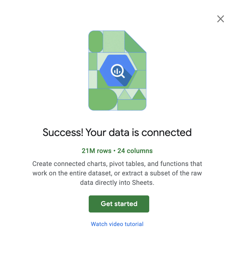
After you click on Connect, you will see a pop-up that says that your data is connected.
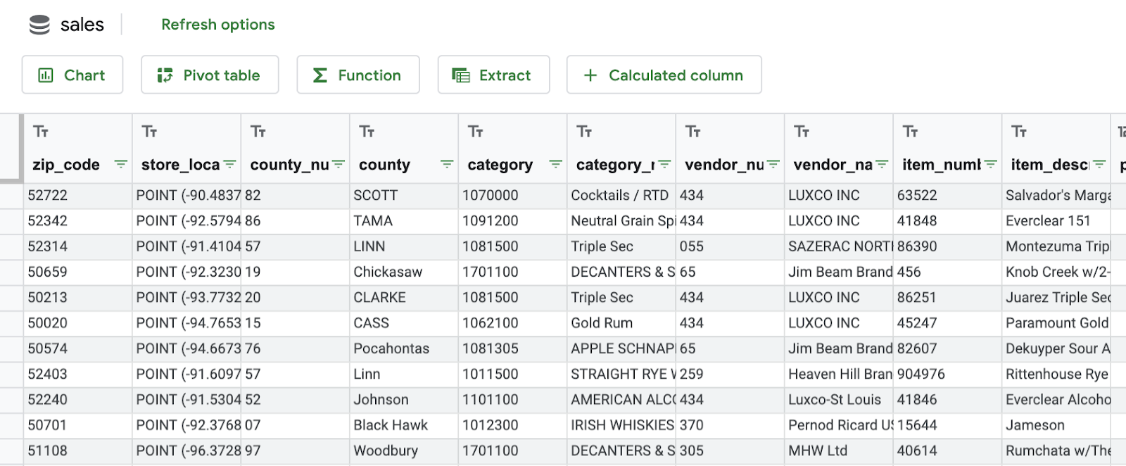
## Explore the table that is displayed and check if you have all the fields you need for your analysis.

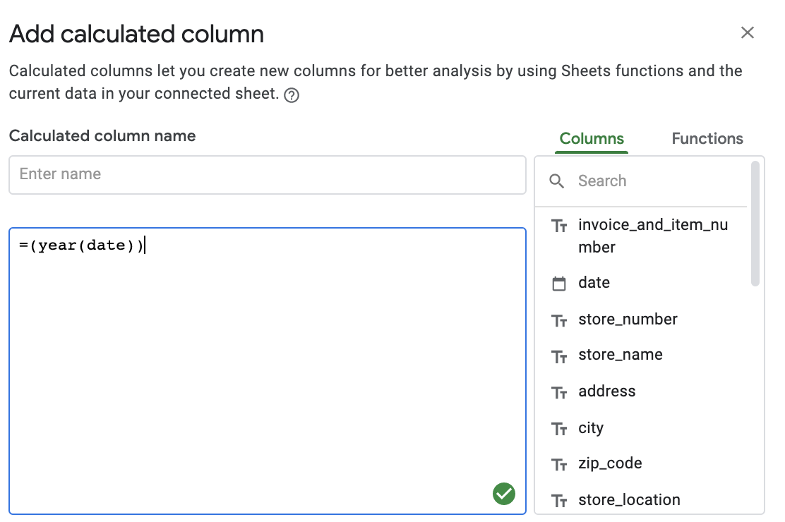
## Complete your table with calculated fields, if you need to add extra information based on your data.
For example, you can extract the year from the date to add to a ***Year*** column using `=year(date))`, or you can calculate VAT from the price for a ***Taxes*** column: `=price*0.2`.
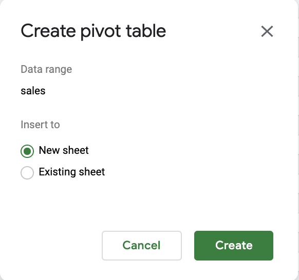
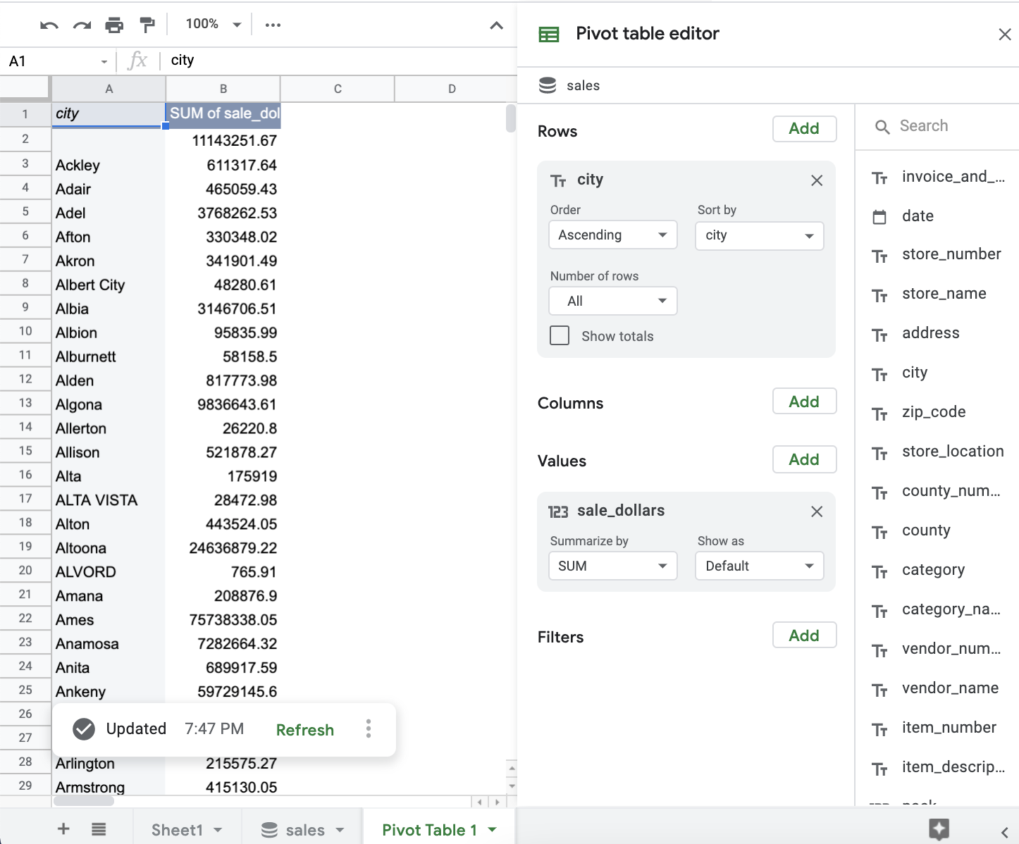
## Create a pivot table based on your data.
A pivot table summarizes the data of a more extensive table. For example, if you want to analyze the sales per city per month, best practice would be to have cities as Y axis lines, and months as X axis columns.
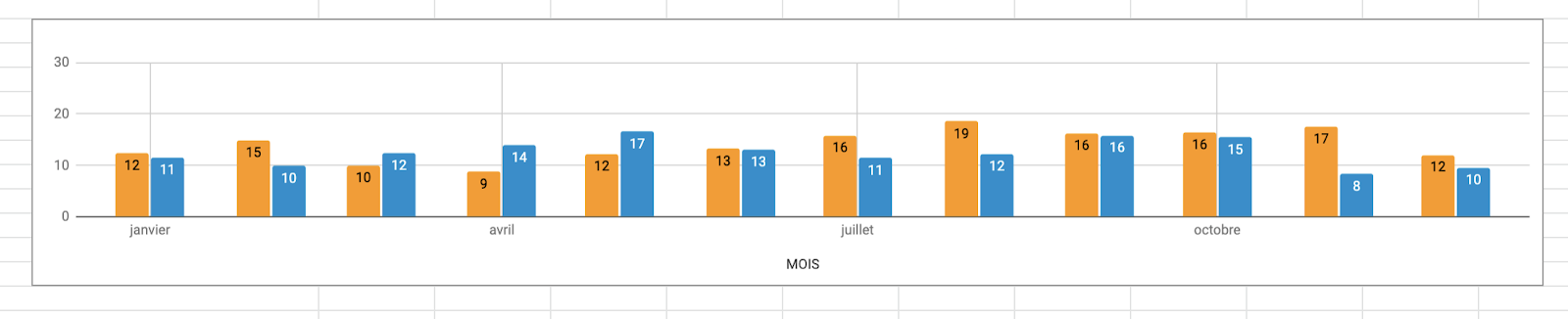
## Based on your pivot table or other data, create a chart to communicate important changes.
Last edited by @hesh_fekry 2023-11-14T15:25:42Z