Business Benefits
Increase the impact of key metrics and other singular data values.
Treat numbers as a data visualization when they are singular, important, specific values that will be useful to the audience, like key performance indicators (KPIs).
Numbers are the most fundamental type of data visualization: they are a precise and unambiguous representation of a metric. However, having too many metrics represented as numbers can often be ineffective due to the capacity limitations of short-term memory.
Add relevant context like the name of the metric the value represents, a comparison of the metric to a benchmark, target, and/or previous time period, and a sparkline or other visualization showing intra-period variations within the metric total for the number.
A number as a data visualization can seldom stand alone. The following example of a dashboard widget incorporates a comparison and a sparkline trend chart as context:

Include a 000s delimiter and format the number for readability.
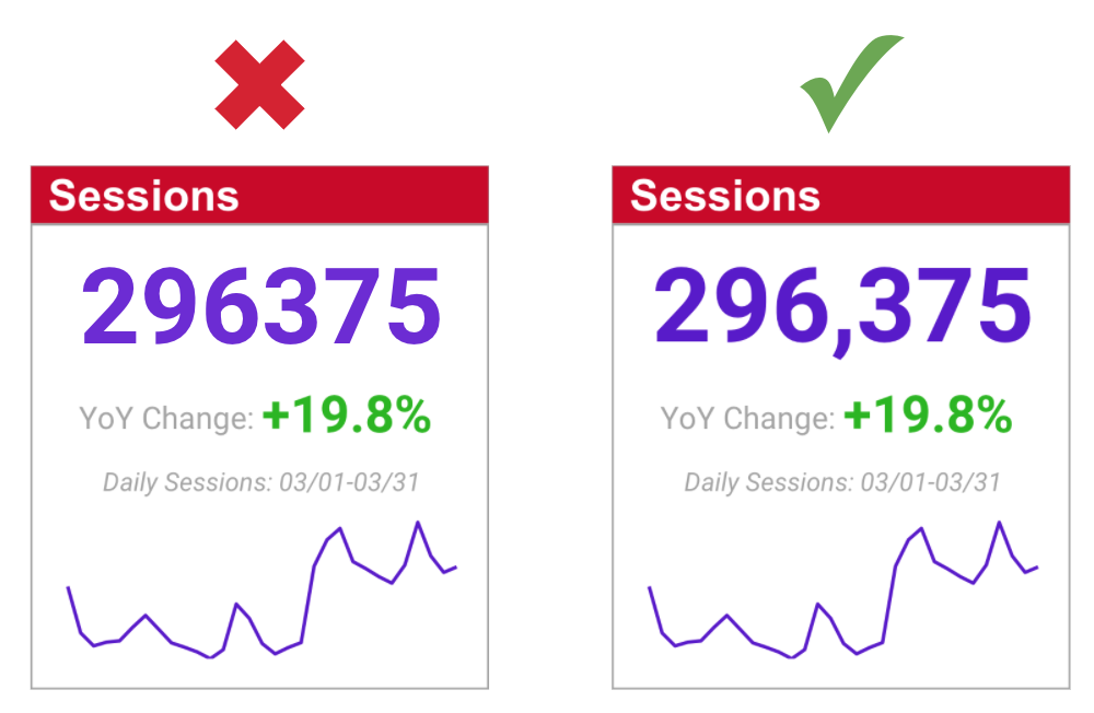
Choose a large and dominant font size at least 50% larger than nearby text to give the number more visual weight relative to other information on the screen or page.
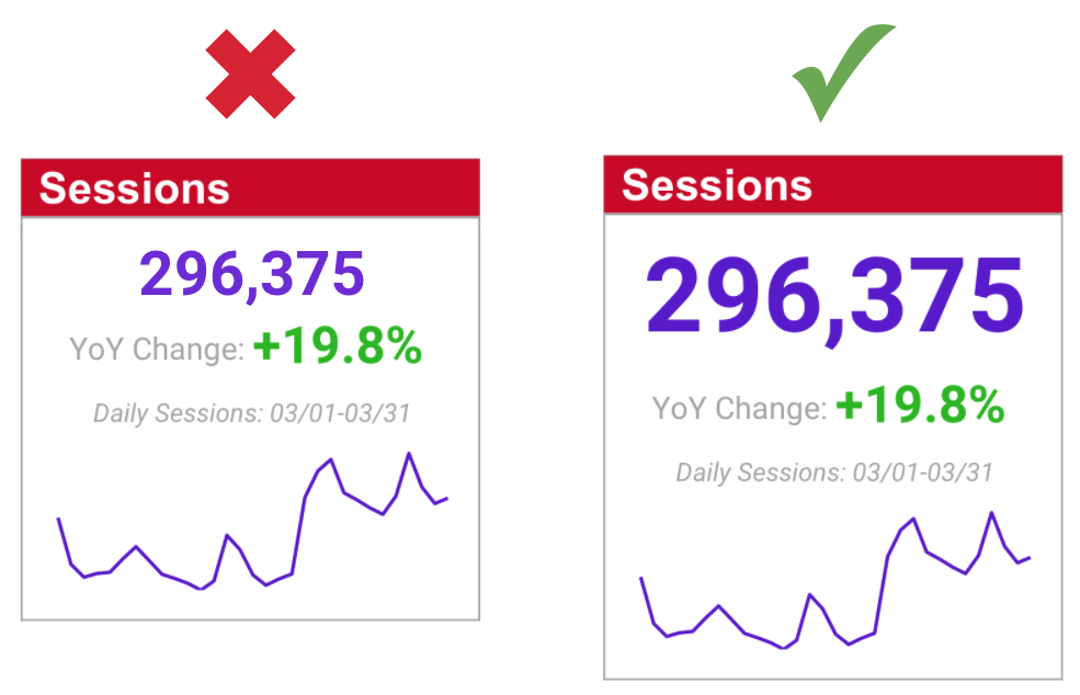
Properly Differentiated Font Size in a Dashboard Widget Showing a KPI
This also applies to text representations of metrics being used inside slide decks as part of a data story:

Metric Being Treated as a Visualization within a Data Story Slide
Last edited by @hesh_fekry 2023-11-14T11:10:40Z