Business Benefits
Clearly show the strength of the relationship between two metrics for which multiple data points are available.
Use a data visualization platform like Tableau, Power BI, Excel, Google Sheets, R, or Python to create the base scatterplot, ensuring that the axes are zero-based if both metrics cover values greater than zero.
Many data visualization platforms automatically set the x- and y-axes to a minimum value just below the minimum value in the data set, rather than setting them to zero, when creating a scatterplot. This can be misleading, as the chart audience will interpret the chart as having both axes as starting at zero even if they do not.
The following chart is an example where the x-axis was automatically set to start at 55,000 rather than zero:

We can start by setting the x-axis to start at zero:

Assess whether this introduces too much blank space. This is a balancing act and a judgement call. While using zero-based axes will reduce the risk of the chart being misinterpreted, it may also compress the key data so that it is more difficult to see a pattern. Any adjustments can be made in the following step.
Adjust the starting point for one or both axes to be non-zero if setting it to zero compresses the actual data on the chart too much.
If in the previous step you determined that having one or both axes set to zero compresses the actual data on the chart too much, then split the difference on the starting point for the problem axis. Leave some white space to avoid your audience inadvertently interpreting the data as starting near zero, but reduce the amount of white space shown by setting the axis to be non-zero. This will also spread out the data points.
For example:

Choose a data point size that balances data visibility with showing distinct data points based on the raw number of data points on the scatterplot.
This, again, is a judgement call. Your goal is to balance seeing distinct points that don’t cluster into blobs with the points being large enough to be the most prominent aspect of the chart.

Scatterplot with data points that are too large
Scatterplot with data points that are too small

Scatterplot with data points that are an appropriate size
Add transparency to the points on the scatterplot to ensure any overlapping points are still visible as distinct points.
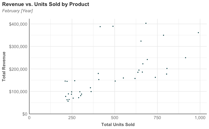
Most visualization platforms support adding transparency, although some will name the setting alpha or opacity. For example, the data points in the chart below are slightly transparent, and you can see this in the points clustered around the area on the chart where x = 250 and y = $100,000.
Use a combination of shapes and colors that are color-blindness friendly when distinguishing between different categories within the data.
If the scatterplot has multiple groups of data, use a combination of distinguishable shapes and colors to ensure data points are distinguishable when viewed by someone with color blindness. For example, the chart below would be difficult for someone with red-green color blindness to interpret:

Scatterplot with categories using the same shape and red and green colors.
The scatterplot above will appear like the one below to someone with red-green color blindness. Note how Category A and Category B are barely distinguishable:

Use different shapes for each category and avoid the colors red and green, to make the chart readable regardless of whether it is printed in grayscale or viewed by a color-blind user. It’s worth noting that red and green also connote “bad” and “good,” which, if not intentional, can be problematic.
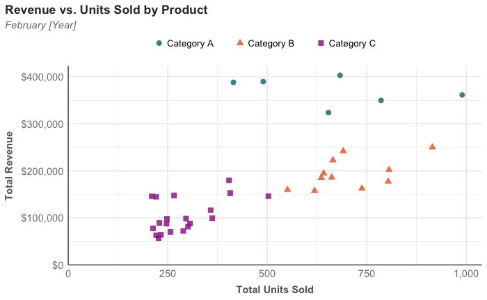
Scatterplot using different shapes and less problematic colors for different categories
Add direct labels or annotations to call out key takeaways and draw a conclusion from the chart if using it to illustrate something specific in the data.
Don’t leave the full interpretation of the chart up to your audience. Directly label or annotate the chart if there is something specific in the data that you are trying to illustrate.

Last edited by @hesh_fekry 2023-11-14T11:10:47Z