Business Benefits
Find patterns in a metric using a simple visualization.
Select the two dimensions you will be using and the metric that will be represented.
A heatmap is simply a visualization of a single metric as it changes across two dimensions:
- The dimensions can be numerical or categorical values.
- The metric must be a numerical value.
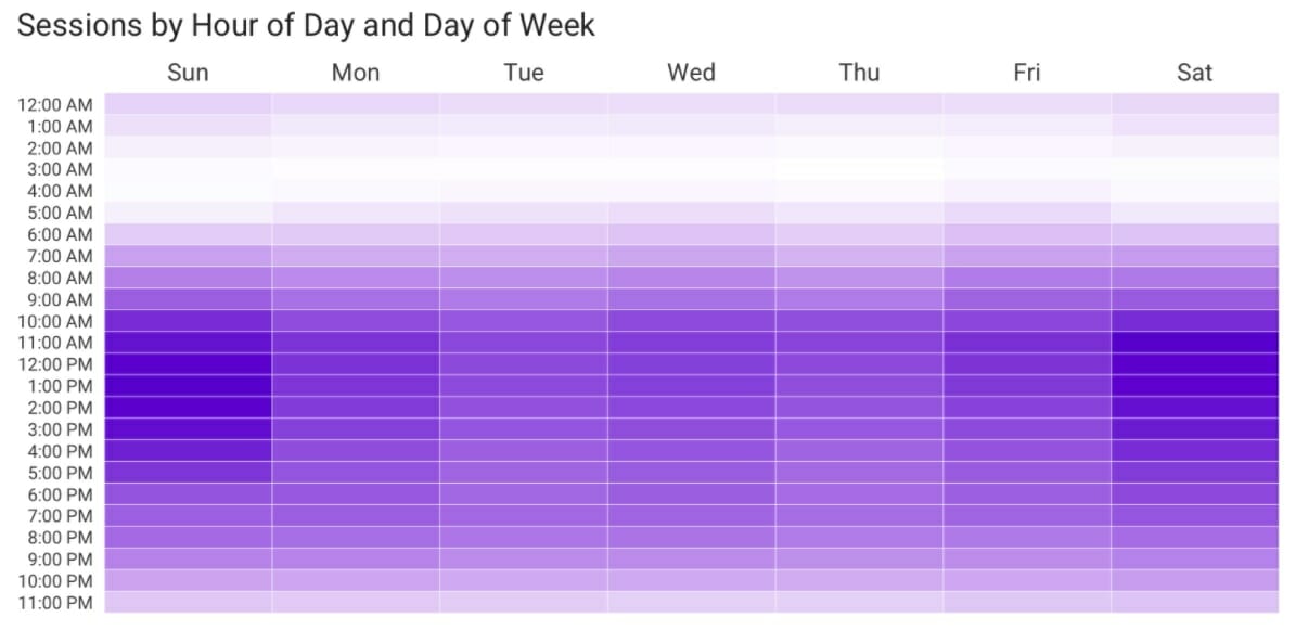
Heatmap Using a Categorical Variable for the X-Axis (Day of Week) and a Numerical Variable (Hour of the Day) for the Y-Axis.
Choose which dimension to use on each axis.
Consider the following factors when determining which dimension to put on which axis:
- If one of the dimensions is some form of time (time of day, date, day of week), then this should typically be the x-axis dimension unless there is a specific reason to put it on the y-axis.
- For a “taller” final visualization, put the dimension with the most values on the y-axis.
- For a “wider” final visualization, put the dimension with the most values on the x-axis.
Order the dimensions logically. If there is no logical order use the metric to give some logic.
If a dimension has a logical order because it is a numerical or ordinal value (e.g., “day of week” is an ordinal value even though it is not numerical; it has a natural order to it), it can be used.
Heatmap Ordered Based on the Natural Order of the Dimensions
If a dimension does not have a logical order, consider ordering it based on the value of the metric being plotted.

Heatmap Ordered Based on the Metric Value.
Select a single color with a gradient when the metric is representing variation in magnitude or two colors if the metric represents a variation from bad to good.
If the metric is simply representing the relative magnitude of the metric (it’s not directly representing “good” vs “bad” or “positive” vs. “negative”), then pick a single color and then have the color scheme be a gradient from that color to either white or a light gray.

If the metric crosses a natural boundary of good vs. bad and you want the heatmap to show the magnitude of each, select two colors for the extremes, shading down to white or light gray in the middle. Try not to use green and red for this, as this will be an ineffective heatmap for anyone who has red-green color blindness (deuteranopia). Select the “boundary” color where the value crosses from good to bad as white or a light gray.

Decide whether to display the metric values themselves.
If the specific value for each cell in the heatmap are not key for the audience to know, then do not include the values in the cells. Depending on the application being used to create the heatmap, you may be able to have the specific value appear when the user hovers over a cell.
Apply the color rules to the visualization.
Use the design decisions determined above to create the heatmap.If using a spreadsheet (Excel or Google Sheets), these decisions can be implemented using conditional formatting, including turning off the display of the values in each heatmap cell.
Last edited by @hesh_fekry 2023-11-14T15:10:18Z