Business Benefits
Provide value to improve conversions and UX on your website.
Audit your website to identify areas to improve with images and areas that you want your audience to focus on.
Consider running heat maps or recorded user testing with tools like Hotjar or Maze before starting this process to back your audit with evidence. In this audit, identify:
- Text-heavy sections that need visuals.
- Pages that need visual examples, like blog posts or product pages.
- What you want to draw attention to, like a call to action button, content offer, or product image.
- Low-quality or irrelevant images to remove.
- Any image-heavy pages without a strong focus.
Remove low-quality images from your website.
This includes images that are:
- Irrelevant.
- Distracting.
- Generic.
- Overcrowding the space.
- Not fitting your target audience.
To determine if an image is generic, look at competitors and similar sites to see if they use the same or similar stock images.
Create or choose images for your site that are high resolution, on-brand, feature one main subject, and match the page’s tone and purpose.
Look for, or create images that are specific to your company and supplement the web copy, like Theragun’s product image that addresses the question of how quiet the product is, instead of images that could be on any similar website.
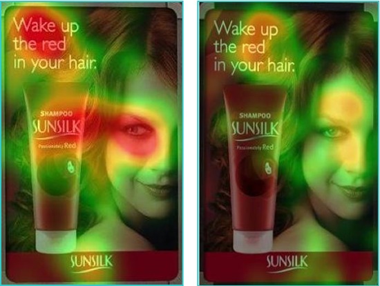
Use an image that looks at or points to what you want to draw attention to on the page to provide a directional cue.
In one user testing example, more people looked at the product when the model’s eyes were looking at the product instead of when the model was looking forward.
Choose an image with a subject whose eyes or fingers point a specific direction, or an image with leading lines that naturally draw the eye to a certain place on the page, like your call to action, product, or content offer.
Create a visual hierarchy by emphasizing the more important page elements through size, contrast, and surrounding whitespace.
A larger image commands more attention than a smaller image. For the more important page elements, like your headline, call to action, product images, or signup form, draw attention to these sections by following at least one of these guidelines:
- Make it larger than less important elements.
- Add more whitespace around the important element.
- Make the imagery brighter or more in focus compared to surrounding elements.
Place the important element in the top left corner or on a Z-pattern line to match where the eye naturally goes.
Include an image with a face next to the copy you want to humanize or draw attention to.
For example, add a small customer headshot next to their testimonial. This will make the testimonial feel more genuine, is more eye-catching than just text according to original research, and serves a purpose on the page.
Use animated elements to draw the eye to an important section or to show multiple images within one space.
Examples include a background video, image change on hover, animated video, like Drip’s homepage with animated videos showing how the product works, or an icon micro-animation, like Facebook’s reaction icons on hover. Animate on appearance, scroll, or hover, instead of continuous or looping animation, to avoid distracting the user.
Break up text heavy pages or sections with a relevant, useful image.
For example, break up a blog post between about every five paragraphs with a relevant graph, embedded tweet, photograph example, useful illustration or diagram, or video thumbnail. Make sure the image adds value, like a chart that outlines the above paragraph, instead of just providing decoration.
Use contrasting images for visual storytelling to show how your product creates positive change.
Since the human eye is drawn to contrast, use imagery with contrasting elements to show change over time or to make the eye focus on the brighter, more in focus, color, or larger image. Some examples include:
- Black and white image depicting the problem next to a full color image with your product as a solution.
- Background image with lower opacity and a bright and large font over it to draw your eye to the text.
- Before image versus an after image, like two pictures that show before and after teeth whitening.
Test each image and its placement through A/B, eye tracking, or user testing to determine if an image improves conversions and the user experience.
Use optimization tools like Hotjar’s heat mapping tool, AB Tasty, Optimizely, or Crazy Egg. Use eye tracking heatmaps to see if the images help draw attention to where you wanted to draw attention to. Look at conversion metrics to assess the placement, size, and inclusion of each image.
Last edited by @hesh_fekry 2023-11-14T10:50:23Z