Business Benefits
Create interactive and publication-quality graphs for data analysis and visualizations.
Create a basic scatter plot with Plotly to display the data using x and y axes.
For example, this code shows how to plot a basic scatter plot where x and y are given as array_like objects:
x and y given as array_like objects
import plotly.express as px
fig = px.scatter(x=[0, 1, 2, 3, 4], y=[0, 1, 4, 9, 16])
fig.show()
```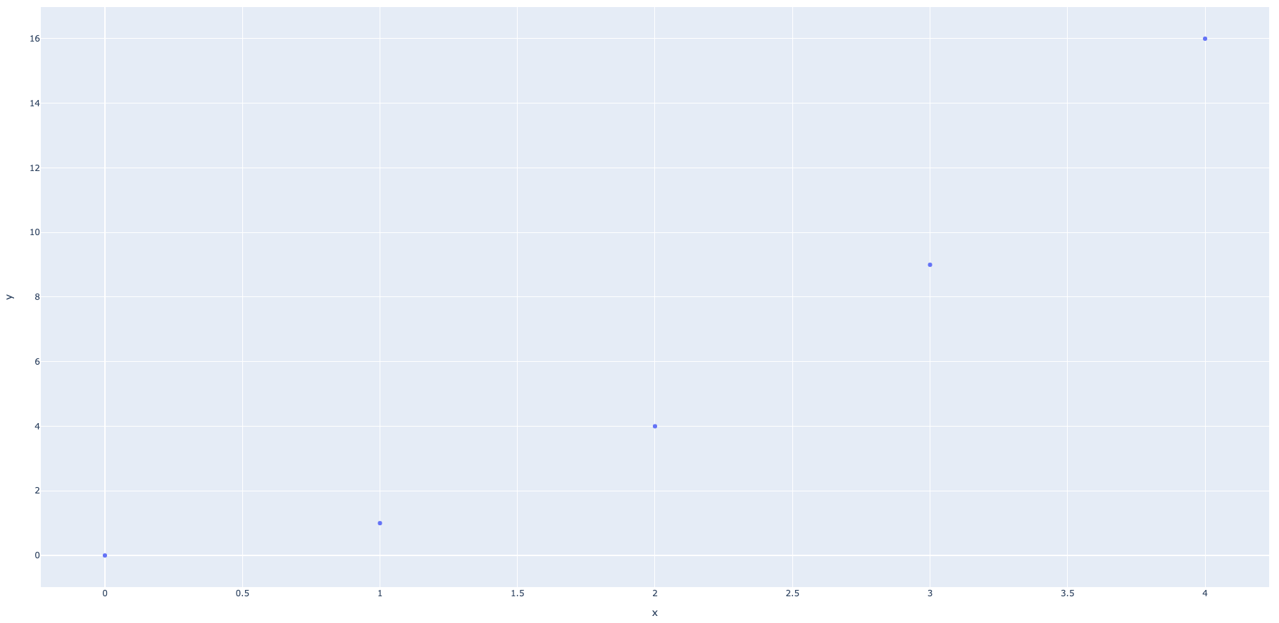
*Image source: [Plotly.com](http://plotly.com/)*
Add labels to the scatter plot to show the x-axis and y-axis data. For example:
# x and y given as DataFrame columns
import plotly.express as px
df = px.data.iris() # iris is a pandas DataFrame
fig = px.scatter(df, x="sepal_width", y="sepal_length")
fig.show()
*Image source: [Plotly.com](http://plotly.com/)*


## Use the iris method within the dataframe and plotly library to display data in various colors to represent the type of species from the sample data.

In the example below, the iris method is represented by `data.iris()` and is used to set the size, color, and line widths for the different columns representing different species:
import plotly.express as px
df = px.data.iris()
fig = px.scatter(df, x=“sepal_width”, y=“sepal_length”, color=“species”,
size=‘petal_length’, hover_data=[‘petal_width’])
fig.show()
*Image source: [Plotly.com](http://plotly.com/)*


## Use the prepackaged functions available in the Plotly library to create a line plot with Plotly Express.

This is a line graph plotted with the prepackaged functions available in the Plotly library:
import plotly.express as px
import numpy as np

t = np.linspace(0, 2*np.pi, 100)

fig = px.line(x=t, y=np.cos(t), labels={'x':'t', 'y':'cos(t)'})
fig.show()
*Image source: [Plotly.com](http://plotly.com/)*


## Use Plotly graph objects and the sample dataset available in the Plotly library to create line and scatter plots.

The example below showes a line and scatter plot created using Plotly graph objects:
import plotly.graph_objects as go

# Create random data with numpy
import numpy as np
np.random.seed(1)

N = 100
random_x = np.linspace(0, 1, N)
random_y0 = np.random.randn(N) + 5
random_y1 = np.random.randn(N)
random_y2 = np.random.randn(N) - 5

fig = go.Figure()

# Add traces
fig.add_trace(go.Scatter(x=random_x, y=random_y0,
                    mode='markers',
                    name='markers'))
fig.add_trace(go.Scatter(x=random_x, y=random_y1,
                    mode='lines+markers',
                    name='lines+markers'))
fig.add_trace(go.Scatter(x=random_x, y=random_y2,
                    mode='lines',
                    name='lines'))

fig.show()
*Image source: [Plotly.com](http://plotly.com/)*


## Use Plotly Express built-in functions to create statistical charts such as box plots, histograms and distribution plots for statistical analysis.

For example, the following is a histogram with a predefined dataframe showing the `total_bill` (x axis) and `count` (y axis) created using Plotly Express' built-in functions:
import plotly.express as px
df = px.data.tips()
fig = px.histogram(df, x=“total_bill”)
fig.show()
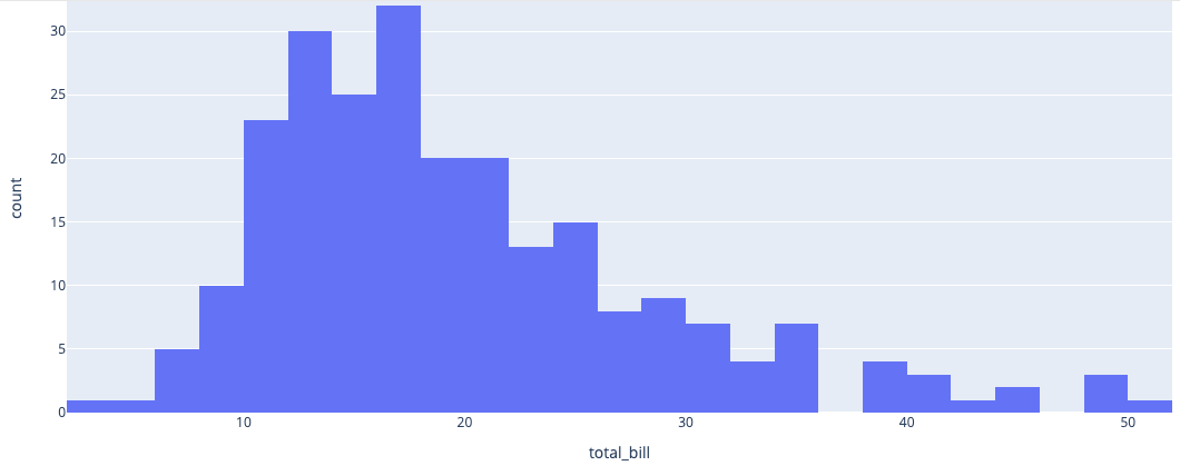
*Image source: [Plotly.com](http://plotly.com/)*
The next example is a histogram with columns populated with categorical data and displayed by day:
import plotly.express as px
df = px.data.tips()
fig = px.histogram(df, x=“day”)
fig.show()
*Image source: [Plotly.com](http://plotly.com/)*


## Create histograms using the Dash library and sample dataset within the Plotly library.

The following example is a histogram created using Dash with parameters to adjust mean and standard deviation:
import dash
import dash_core_components as dcc
import dash_html_components as html
from dash.dependencies import Input, Output
import plotly.express as px
import numpy as np

np.random.seed(2020)

app = dash.Dash(__name__)

app.layout = html.Div([
    dcc.Graph(id="graph"),
    html.P("Mean:"),
    dcc.Slider(id="mean", min=-3, max=3, value=0,
               marks={-3: '-3', 3: '3'}),
    html.P("Standard Deviation:"),
    dcc.Slider(id="std", min=1, max=3, value=1,
               marks={1: '1', 3: '3'}),
])

@app.callback(
    Output("graph", "figure"),
    [Input("mean", "value"),
     Input("std", "value")])
def display_color(mean, std):
    data = np.random.normal(mean, std, size=500)
    fig = px.histogram(data, nbins=30, range_x=[-10, 10])
    return fig

app.run_server(debug=True)
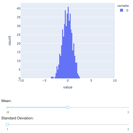
*Image source: [Plotly.com](http://plotly.com/)*
## Use the sample dataset within the Plotly library to create funnel charts.
Funnel charts are extremely useful to marketers, as they can be used to better illustrate lead conversion metrics.
Below is an example of a funnel chart showing website visits (shown in numbers) per funnel stage (shown as variable stages):
import plotly.express as px
data = dict(
number=[39, 27.4, 20.6, 11, 2],
stage=[“Website visit”, “Downloads”, “Potential customers”, “Requested price”, “invoice sent”])
fig = px.funnel(data, x=‘number’, y=‘stage’)
fig.show()
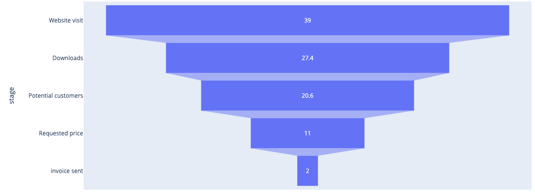
*Image source: [Plotly.com](http://plotly.com/)*
The `texposition `and `textinfo` libraries within Plotly's funnel chart library can also be used to show different funnel steps in different colors.
Below is an example of how you could customize a funnel chart:
from plotly import graph_objects as go

fig = go.Figure(go.Funnel(
    y = ["Website visit", "Downloads", "Potential customers", "Requested price", "Finalized"],
    x = [39, 27.4, 20.6, 11, 2],
    textposition = "inside",
    textinfo = "value+percent initial",
    opacity = 0.65, marker = {"color": ["deepskyblue", "lightsalmon", "tan", "teal", "silver"],
    "line": {"width": [4, 2, 2, 3, 1, 1], "color": ["wheat", "wheat", "blue", "wheat", "wheat"]}},
    connector = {"line": {"color": "royalblue", "dash": "dot", "width": 3}})
    )

fig.show()
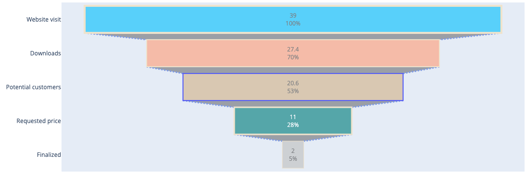
*Image source: [Plotly.com](http://plotly.com/)*Last edited by @hesh_fekry 2023-11-14T11:07:53Z