Business Benefits
Create a line chart that is readily interpretable and impactful.
Confirm that a line chart is the appropriate chart to use for the data visualization and avoid using line charts to connect categorical data.
Line charts are best for showing how a metric has changed over time.

Technically, we interpret line charts by looking at the relative slopes of the line(s) between each pair of points (the greater the slope, the greater the change). Avoid using line charts to connect categorical data.

People will tend to interpret the categorical data as though there is a trend across the categories, which is not the case.
Limit the number of distinct lines in a single line chart to 3-5 to keep it easy to interpret.
While many data visualization platforms will automatically generate charts with many more distinct lines, they are difficult for the brain to interpret.

Two alternatives to consider if you have numerous categories you are considering plotting on a single chart:
- Don’t include the smaller categories. Add a note below the chart explaining that they are not shown.
- Group together the data for the smaller categories into a single “Other” category. Again, add a note that explains what categories are grouped together.
Another option is to include all the series as separate, individual charts.
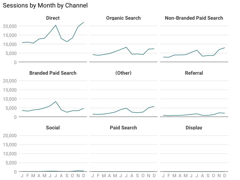
While separating each data series into a separate chart requires your audience to look at multiple charts, it allows them to focus on a limited number of categories at a time.
Show two charts next to each other with separate, independent scales instead of plotting different metrics on a second axis in a single line chart.
Avoid plotting two different metrics on a single line chart by introducing a second axis, since your audience will need to mentally split out the data. This, in turn, makes them more likely to see something in the chart as significant when it’s actually arbitrary. In the example below, the fact that the lines cross in August is purely the result of the scale used for the second axis.
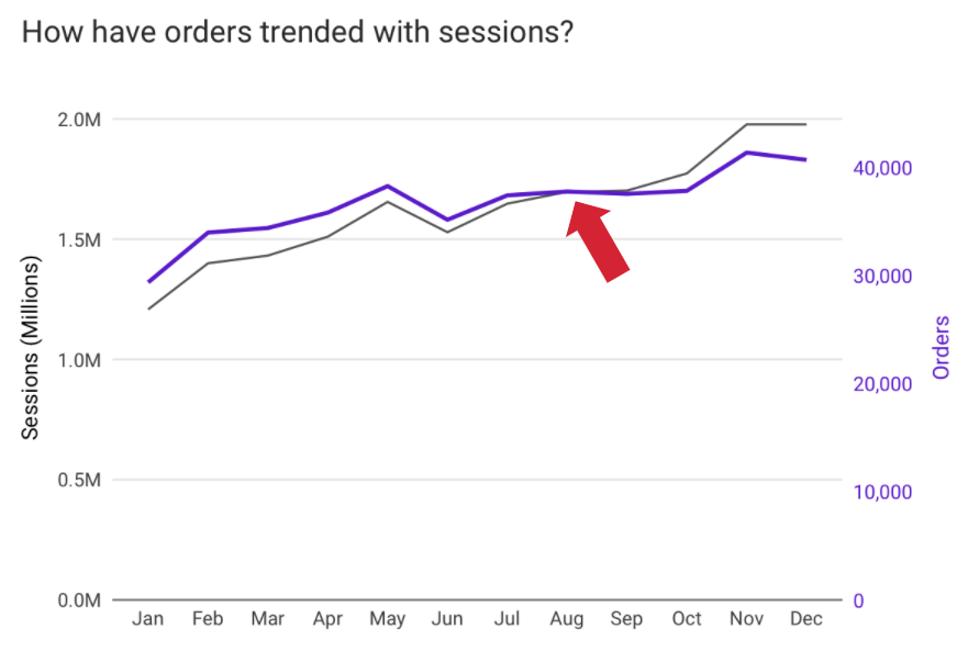
You could represent the same data in the chart below, which could lead the audience to note that the metrics have been diverging since January. Again, though, this is purely a factor of the scale selected for the secondary axis.

Rather than combining metrics on a single chart, show two charts next to each other with separate, independent scales.

Remove irrelevant lines and text from the chart and don’t add labels and shapes to every point on the chart.
Decrease the chart’s cognitive load by removing irrelevant lines and text from the chart and limiting the labels and shapes you add. The chart below is visually overwhelming.

If the audience needs the exact value for each point on the chart, provide this separately in a table. Alternatively, some BI platforms allow the user to mouse over a point to get its details.
Use labels or shapes at key vertices to call out takeaways to which you want to draw the user’s attention.
Adding shapes and labels to specific data points on the chart you want to highlight is an effective way to draw the user’s eye to them. For example, the chart below has two points highlighted by adding circles and data labels just for those two points.

Last edited by @hesh_fekry 2023-11-14T11:10:48Z